
Uplifting Shopify Polaris
提升 Shopify Polaris
The process of evolving a large scale design system
大规模设计系统的演化过程
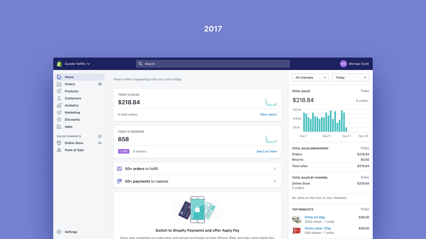
For years, Polaris’s design language has been relatively unchanged. It was heavily influenced by the once-pervasive flat design trend, and although there was a minor update in 2020 with new colors and illustrations, the core design philosophy barely evolved.
多年来,Polaris的设计语言基本保持不变。它受到了曾经盛行的扁平设计趋势的很大影响,尽管在2020年进行了轻微更新,包括新的颜色和插图,但核心设计理念几乎没有改变。
Before flat design took hold in the early 2010s, software had more dimensionality and tried to mimic the real world. Then, new minimalism fostered cleaner interfaces, made things easier to understand, and made experiences feel more efficient. This was fantastic. Whenever Shopify removes complexity from its product, merchant success goes up. Flat design definitely had a role in that.
扁平化设计在2010年代初开始流行之前,软件具有更多的立体感,并试图模仿现实世界。然后,新的极简主义促进了更清晰的界面,使事物更易于理解,并使体验更高效。这是很棒的。每当Shopify从其产品中去除复杂性时,商家的成功就会提高。扁平化设计在其中肯定起到了作用。

Minimalism had run its course when merchants started classifying the Admin experience as “dull”, “depressing” and “bland”. Polaris helped standardize this sterile feeling, with a UI that was not optimized for the kind of work merchants have to do everyday.
极简主义已经走到尽头,当商家开始将管理体验归类为“乏味”、“沮丧”和“单调”时。Polaris帮助标准化了这种冷漠的感觉,其用户界面并没有针对商家每天必须完成的工作进行优化。
Shopify’s Admin is not just a website, it’s a professional tool. So it should feel like that — but one with soul. So we set about making it feel that way.
Shopify的管理后台不仅仅是一个网站,它是一个专业工具。因此,它应该有这种感觉,但又带有灵魂。因此,我们着手让它有这种感觉。
The starting point 起点
With that realization, at the end of last year, Thomas Jonkajtys — a fellow designer — and I teamed up with the mission of uplifting Polaris’s design language.
在去年年底,我和设计师Thomas Jonkajtys意识到这一点,并联合起来,致力于提升Polaris的设计语言。
The initial brief was pretty simple, we wanted to make the Admin feel more like a “pro tool”.
最初的简要要求非常简单,我们希望让管理员感觉更像一个“专业工具”。
What does that actually mean? A few different things:
那实际上是什么意思?有几个不同的含义:
- A pro tool is effective in the way it organizes and displays information.
专业工具在组织和展示信息方面非常有效。 - A pro tool is highly functional, with straightforward visuals, while not being intrusive or decorative.
一款专业工具具有高度的功能性,视觉简洁直接,既不突兀也不过于装饰。 - A pro tool is responsive, and provides interactions that feel almost real.
一款专业工具具有响应性,并提供几乎真实的交互体验。
Ultimately, our design language had to make the product feel more effective and coherent in the context of commerce, while being aesthetically pleasing, and able to create moments of joy.
最终,我们的设计语言必须使产品在商业环境中更具效果和一致性,同时在美学上令人愉悦,并能创造愉悦的时刻。
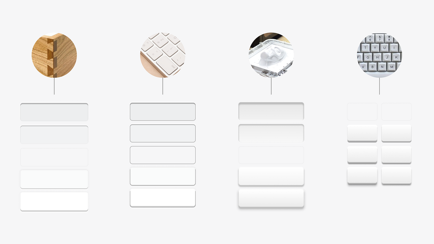
With that said, at this point in the process, these are just words. Design needs visuals, so we started collecting inspiration from products we thought spoke a similar design language to what we were aiming for. Most of them were actual physical products, and not software. We didn’t want to follow any particular digital trend, as the world of merchants is more than just a screen.
说到这一点,在这个过程中,这些只是文字而已。设计需要视觉效果,所以我们开始收集灵感,来自我们认为与我们的设计语言相似的产品。其中大部分是实际的物理产品,而不是软件。我们不想追随任何特定的数字趋势,因为商家的世界不仅仅是一个屏幕。
To define the visual design direction, we created two clusters: one for “this”, and another for “not this”. At this stage it’s important to capture what we want our design language to convey as well as what we want it to avoid.This helps narrow down our options and defines the range in which we’ll be directing, pivoting, and adjusting the language.
为了定义视觉设计方向,我们创建了两个集群:一个是“这个”,另一个是“不是这个”。在这个阶段,捕捉我们希望设计语言传达的内容以及我们希望避免的内容非常重要。这有助于缩小我们的选择范围,并定义我们将要引导、转向和调整语言的范围。

We also started digging for photos and recordings from previous research studies to get a better understanding of the environment in which merchants operate: Where do they work? What’s on their desk? What objects do they often use?
我们还开始搜集以往研究中的照片和录音,以更好地了解商家经营的环境:他们在哪里工作?他们的桌子上有什么?他们经常使用哪些物品?
This helped us understand merchants at a different level, and find inspiration in objects that could bring a sense of familiarity.
这帮助我们以不同的层次理解商人,并从物品中找到能带来熟悉感的灵感。

商家的真正任务控制(研究照片)。
Good design can be dictated, but great design comes from understanding the way your users function in their space and offering solutions that make their lives easier.
好的设计可以被规定,但伟大的设计来自于理解用户在他们的空间中的功能,并提供能够让他们生活更轻松的解决方案。
Diverging 分歧

With a more concrete understanding of the range we wanted to explore, we worked with fellow Polaris designers Sara Hill and Joe Thomas, to broaden and accelerate our exploration.
通过对我们想要探索的范围有更具体的理解,我们与波拉里斯的设计师Sara Hill和Joe Thomas合作,以扩大和加速我们的探索。
Design needs constraints and instructions, so we defined a few rules:
设计需要约束和指导,因此我们定义了一些规则:
- Keep existing behavior and patterns. Our focus was to evolve the design language, not the entire merchant experience.
保持现有的行为和模式。我们的重点是演进设计语言,而不是整个商家体验。 - Design extremes. We’re not looking for subtlety at this state, and we can always pull back and calibrate afterwards.
设计极端。在这个阶段,我们不追求微妙之处,我们总是可以事后调整和校准。 - Keep it high-fidelity, but high-level. Details can be refined later.
保持高保真度,但保持高层次。细节可以稍后完善。 - Mimic real merchants. Our design language needed to flex and adapt to merchants, working with idealized data doesn’t help achieve this.
模仿真实的商家。我们的设计语言需要灵活适应商家,使用理想化的数据无法帮助实现这一目标。 - Diversify. We wanted to have more visual diversity, more options, and wanted to prevent folks from falling in love with one idea, because most of them would be left on the drawing board.
多样化。我们希望有更多的视觉多样性,更多的选择,并且希望防止人们爱上一个想法,因为大部分想法都会被搁置。
我们分歧探索的小样本。
This divergent exploration brought up many fun ideas. A broader use of color, ambitious skeuomorphism, more 3D, usage of blend modes, you name it. We had covered enough ground to reduce the team back to two, and started the next step in defining the design language.
这种分歧的探索带来了许多有趣的想法。更广泛地使用颜色,雄心勃勃的拟物化,更多的3D效果,混合模式的使用,你可以说出来。我们已经涵盖了足够的领域,将团队缩减到两个人,并开始下一步定义设计语言的工作。
Converging 汇聚

Two very opinionated designers executing on a vision is challenging. We had to build trust throughout the entire process.
两个非常有主见的设计师在执行一个愿景上是具有挑战性的。我们必须在整个过程中建立信任。
The divergent exploration gave us an outlet to experiment, but also gave us exposure to the perspective of other designers. It also served as a way to figure out how we could lean on each other’s strengths.
分歧的探索给了我们一个实验的出口,同时也让我们接触到其他设计师的观点。它还作为一种找出我们如何依靠彼此优势的方式。
Some decisions were easy, like finding a font that felt appropriate to Shopify. We both picked Inter independently, so it became obvious that was the way to go.
有些决定很容易,比如找到一种适合Shopify的字体。我们两个都独立选择了Inter,所以很明显这就是正确的选择。
Other decisions took a bit more fine-tuning:
其他决策需要更多的微调:
Clean but tactile 干净但触感好
It’s easy to lean too far in a direction, go overboard, and end up with something that feels monotone. As we analyzed our divergent explorations, we found valuable elements in both ends of the spectrum.
在某个方向上过度倾斜、过火,最终得到的东西会感觉单调。在我们分析了不同的探索之后,我们发现了光谱两端都有宝贵的元素。
The real challenge was striking the right balance, and finding the combination of elements that complemented each other.
真正的挑战在于找到合适的平衡,以及找到相互补充的元素组合。

充满活力的探索,大胆运用色彩和3D物体。
When we leaned too much into the dimensionality and vibrancy, everything became busy, and demanded too much attention.
当我们过于倾向于立体感和活力时,一切变得繁忙,需要过多的关注。
清洁探索,将容器减少到最低限度。
When we tried to lean in the opposite direction, it started to feel flat.
当我们试图向相反的方向倾斜时,感觉变得平淡。
Through experimentation and some trial and error we started to narrow down the list of elements that deserved a spotlight, and the ones that should play a supporting role.
通过实验和一些试错,我们开始缩小了值得关注的元素列表,以及应该扮演支持角色的元素。
将两个世界融合在一起。
Since we wanted to move away from a sterile feeling, we started with an extreme that was more tactile, and from there we started designing by subtraction, removing unnecessary complexity until we reached the point where we felt we couldn’t remove anything else.
由于我们想要摆脱冷漠的感觉,我们从更具触感的极端开始,然后通过减法设计,去除不必要的复杂性,直到我们觉得再也无法去除任何东西为止。
Interactions became our main vehicle to deliver joy in the experience. We concluded that we wanted joy to come with the accomplishment of a task, and avoid it to be obtrusive and void of meaning.
互动成为我们传递体验中的主要方式。我们得出结论,我们希望在完成任务时带来快乐,并避免它变得突兀和毫无意义。
A button that feels just right
一个感觉刚刚好的按钮
Buttons are one of the most important pieces of a UI, because they are the main visual indicators for the actions a user can take. It didn’t come as a surprise the level of scrutiny our buttons went through, and to get it right, we went through a good amount of iterations.
按钮是用户界面中最重要的组件之一,因为它们是用户可以执行的操作的主要视觉指示器。我们的按钮经历了严格的审查并进行了多次迭代,以确保正确无误。
基于真实材料定义按钮。
We wanted to make buttons feel real, so we started from mimicking the real world. From there it was an iterative process of making sure the buttons hit the right notes.
我们希望让按钮感觉真实,所以我们从模仿现实世界开始。从那里开始,我们进行了一系列的迭代过程,确保按钮达到了正确的效果。

按钮样式的第6次迭代
They had to feel tactile, but not too imposing.
他们必须有触感,但不要过于压迫。
They had to feel like plastic, not glass.
它们必须感觉像塑料,而不是玻璃。
Last, and probably more importantly, the interaction had to feel juicy.
最后,而且可能更重要的是,互动必须感觉到有趣。

主按钮的触感进行了10次迭代
The primary button became a challenge, since we initially lacked darker values to make it feel three dimensional. We partially solved it with a “shine”, but then realized the pressed state needed some attention too.
主按钮成为一个挑战,因为我们最初缺乏较暗的值来使其具有三维感。我们部分解决了这个问题,通过添加“光泽”,但后来意识到按下状态也需要一些关注。
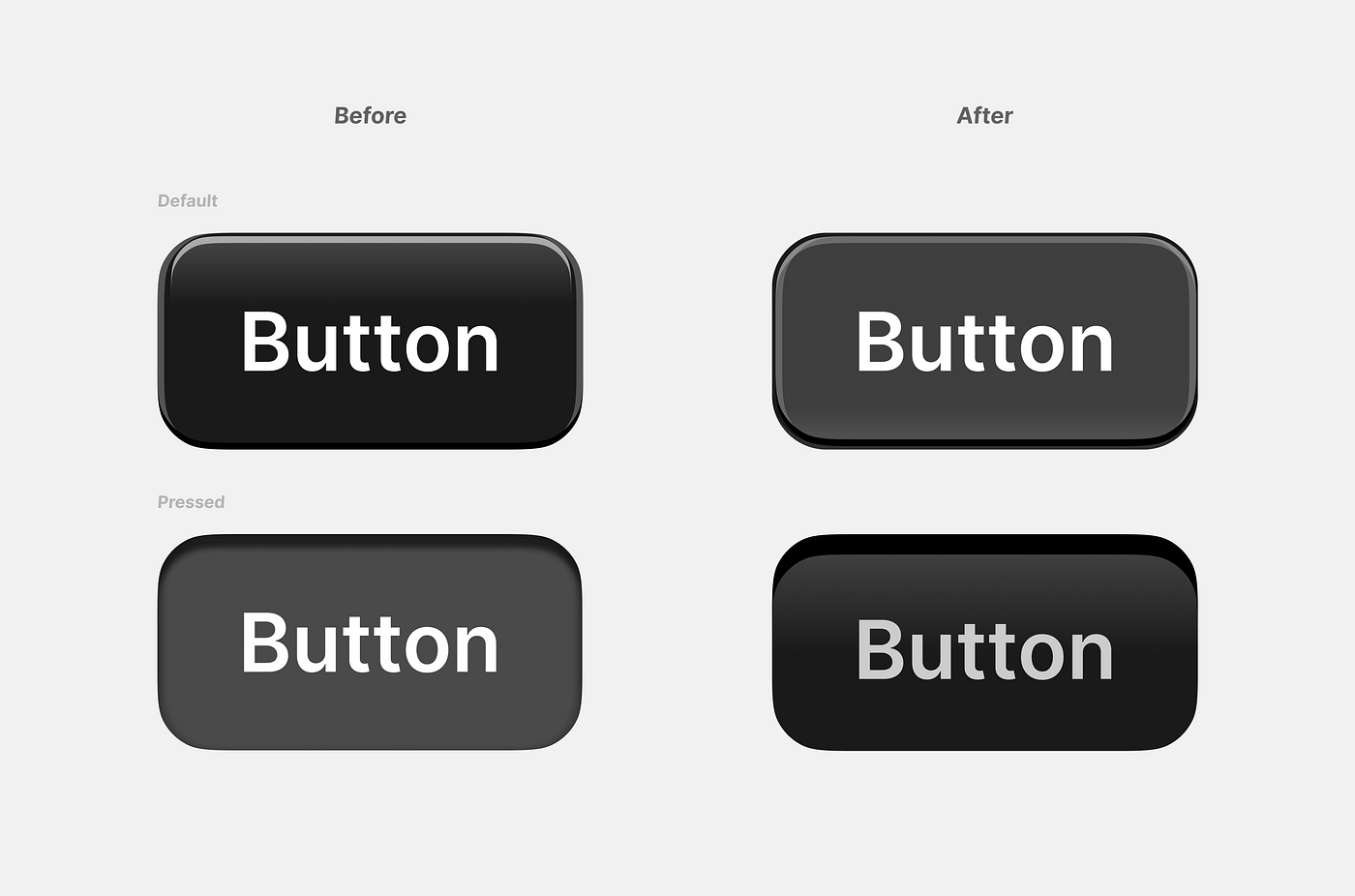
之前和之后。从光滑的玻璃到哑光塑料。
After making the default button a touch lighter, we landed on a solution that had the level of juiciness we were looking for.
在将默认按钮稍微变亮后,我们找到了一个解决方案,它具有我们所期望的丰富感。
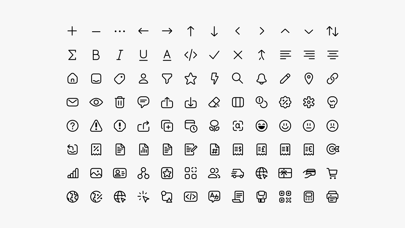
Icons with just enough weight
具有适度重量的图标
Icons are instrumental in reducing text overload and augmenting efficiency. We saw in the iconography an opportunity to inject a dash of joy and make the experience more approachable.
图标在减少文字负担和提高效率方面起着重要作用。我们在图标设计中看到了一个机会,可以注入一丝欢乐,使体验更加亲近。
The challenge with icons was finding the appropriate scale and weight. We strived for icons that were in harmony with typography, noticeable without being overpowering, and with a unique personality that doesn’t dominate the interface.
图标的挑战在于找到合适的比例和粗细。我们努力寻求与排版和谐一致的图标,既能引人注目又不过于强大,并且具有独特的个性,不会主导界面。
我们设计的众多套装之一被废弃了。
For each style iteration, we designed dozens of icons, because we had to see them in context to find which performed the best.
对于每个样式迭代,我们设计了数十个图标,因为我们必须将它们放入上下文中,以找出哪个表现最好。
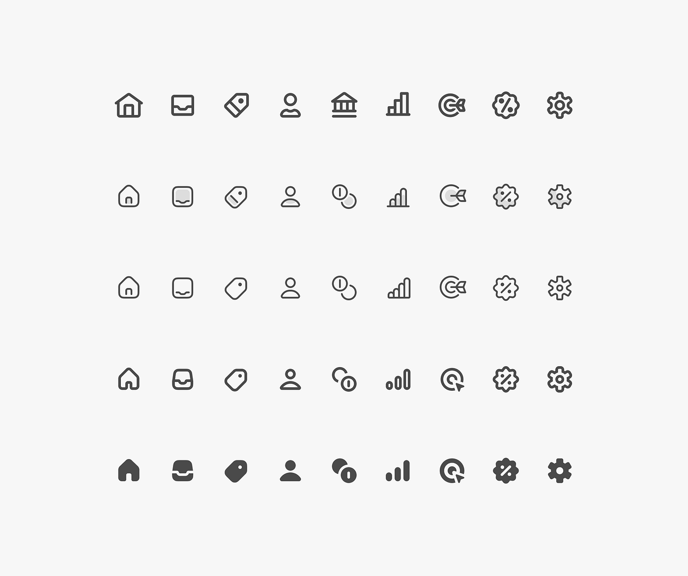
我们尝试的一些变体:1.5像素的轮廓;双色调带有1像素的轮廓;1像素的轮廓;1.5像素的轮廓;填充。
After numerous iterations, we settled on a set with 1.5px outline, with filled variants used for navigation.
经过多次迭代,我们最终确定了一个带有1.5像素轮廓的样式集,其中填充变体用于导航。
These icons performed well in a dense interface, drawing just the right amount of attention, while the filled navigation icons anchor the user’s experience.
这些图标在密集的界面中表现出色,吸引了适量的注意力,而填充的导航图标则稳定了用户的体验。
From green to black 从绿色到黑色
The initial choice to retain green as the primary color was driven by its association with Shopify’s brand. However, as the design evolved, we found that green didn’t align well with the professional tone we were aiming for.
最初选择保留绿色作为主要颜色是基于其与Shopify品牌的关联。然而,随着设计的发展,我们发现绿色与我们追求的专业氛围不太相符。
Green is often associated with a friendly, approachable interface and positive outcomes, but it didn’t lend itself to the neutrality we sought. We wanted our interface to be neutral, allowing colors to be used semantically and with purpose.
绿色通常与友好、亲切的界面和积极的结果相关联,但它并不适合我们所追求的中立性。我们希望我们的界面是中立的,允许颜色在语义和目的上使用。
We turned to black, because it’s commonly associated with “Pro” products. Black brings impact and contrast, which is exactly what we needed for our interactive states.
我们选择了黑色,因为它通常与“专业”产品相关联。黑色带来了冲击力和对比度,这正是我们在交互状态中所需要的。
定义不同交互状态的黑色模型。
While being neutral, using black as a primary color ensured other colors used in the interface wouldn’t be overshadowed, but instead, carry their intended meanings.
在保持中立的同时,使用黑色作为主要颜色确保界面中使用的其他颜色不会被掩盖,而是能够传达它们预期的含义。
We made all our decisions through debates, experimentation, prototyping and more debates. After a while we found something we were ready to push forward. But how did we know it was the right direction?
我们通过辩论、实验、原型制作和更多的辩论来做出所有决策。过了一段时间,我们找到了一些我们准备推进的东西。但是我们怎么知道这是正确的方向呢?
- It was something we were excited to push forward.
这是我们非常期待推进的事情。 - The design language aligned with the brief and the “this” and “not this”.
设计语言与简报以及“这个”和“不是这个”保持一致。 - And as we were applying our design language to more surfaces, the before and after became progressively more dramatic and appealing.
随着我们将设计语言应用于更多的表面,前后变化逐渐变得更加戏剧化和吸引人。
At this point, our positioning was strong, and the design language we carefully crafted was ready for its next trial: reviews with key stakeholders.
在这一点上,我们的定位很强,我们精心打造的设计语言已经准备好进行下一次试验:与关键利益相关者的审查。
Getting buy-in 获得支持

Reviews can be hard, but they are key to turn stakeholders into advocates for our work. We knew it was crucial to listen and address concerns, without forgetting we had to be assertive, and showing the value in our design direction.
评论可能很困难,但它们是将利益相关者转变为我们工作的支持者的关键。我们知道倾听和解决关切至关重要,同时也不能忘记要坚定地展示我们设计方向的价值。
Coming in with a strong point of view for the design language was vital. And reacting to relevant feedback from stakeholders by showing — not telling — the value in our solution gave us more credibility and increased trust. We gave each piece of feedback its fair shot, and we had to be willing to accept when some things actually strengthened the new design language.
强调设计语言的观点至关重要。通过展示而不是说出我们解决方案的价值,对相关利益相关者的反馈做出反应,增加了我们的可信度并增加了信任。我们对每一条反馈都给予了公正的机会,并且必须愿意接受一些事物实际上加强了新的设计语言。
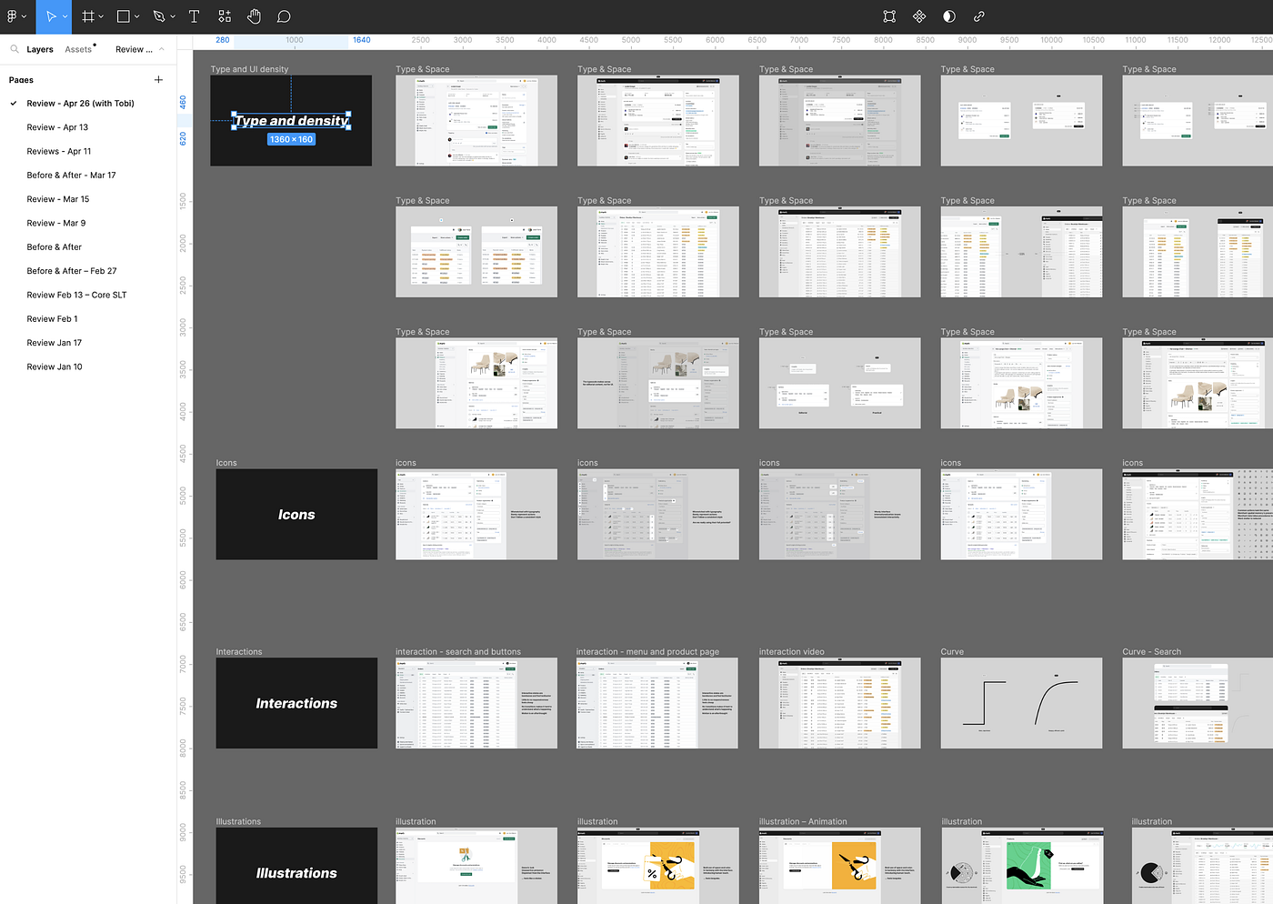
我们Figma幻灯片的一部分快照。
Each presentation deck was tailored for individual stakeholders, enabling discussion to happen at appropriate levels without alienating anyone. We found that leading with visuals rather than design principles shifted the conversations from theory to practicality, and this helped us move forwards.
每个演示文稿都针对个别利益相关者进行了定制,使得讨论能够在适当的层面进行,而不会疏远任何人。我们发现,以视觉为主导而不是设计原则,将对话从理论转向实际,这有助于我们向前推进。
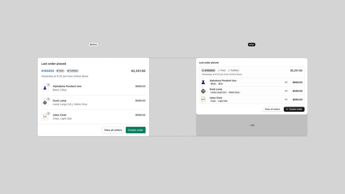
幻灯片显示了一张评论中的前后对比图。
We used a lot of “before and after’’ comparisons, to show folks the value in the change, but that wasn’t enough to capture the feeling of the new design language, so worked with Guilherme Santos — a developer in the Polaris team — and created a working prototype that gave people something more tangible than mockups to interact with, and react to.
我们使用了很多“之前和之后”的比较,来向大家展示这种变化的价值,但这还不足以捕捉到新设计语言的感觉,所以我们与Polaris团队的开发人员Guilherme Santos合作,创建了一个可工作的原型,让人们可以与之互动并做出反应,比起模型,这更具有实质性。

快速浏览我们的工作原型。
Make it happen. Fast! 让它发生。快点!
Our last review was with Tobi, the CEO. And in all honesty, we couldn’t have asked for a better outcome. He saw the value in the direction and we were all excited to ship this to Merchants as fast as possible.
我们上次的审查是与首席执行官Tobi进行的。老实说,我们无法期望得到更好的结果。他看到了这个方向的价值,我们都很兴奋地希望尽快将其交付给商家。
The best time to do that was the upcoming Summer Edition 2023 — in 10 weeks. Previously, it would have been impossible to ship a holistic design change across a complex application like the admin in 10 weeks time. Luckily, the Polaris team had spent the past year gearing up for this moment, with a mission to get the admin to 90% Polaris mainline coverage. The team overhauled Polaris tokens, simplified the release process from 3 steps to 1, created migration and linting tools, and created a coverage dashboard to help product teams get on Polaris mainline. We advocated, incentivized and partnered with feature teams to use Polaris components and tokens. We updated hundreds of lines of code to make sure the product leveraged Polaris.
最佳时间是即将到来的2023年夏季版,即10周后。以前,在10周的时间内,要在像管理员这样复杂的应用程序中进行整体设计变更是不可能的。幸运的是,Polaris团队在过去一年里一直为这一时刻做准备,他们的使命是将管理员的Polaris主线覆盖率提高到90%。团队对Polaris令牌进行了全面改进,将发布流程从3个步骤简化为1个步骤,创建了迁移和代码检查工具,并创建了一个覆盖率仪表板,以帮助产品团队使用Polaris主线。我们倡导、激励并与功能团队合作,使用Polaris组件和令牌。我们更新了数百行代码,确保产品充分利用了Polaris。

期望:线性效应。
After a year, the admin was at 86.6% coverage. This effort required an initial investment, with improvements “below the surface” that didn’t yield a noticeable return for a year. But these small improvements stacked up, and had a compounding effect that enabled us to make such a drastic change to the Admin in a matter of weeks.
经过一年,管理员的覆盖率达到了86.6%。这个努力需要最初的投资,其中的“表面下”的改进在一年内并没有带来明显的回报。但是这些小的改进逐渐积累起来,产生了复利效应,使我们能够在几周内对管理员进行如此巨大的改变。
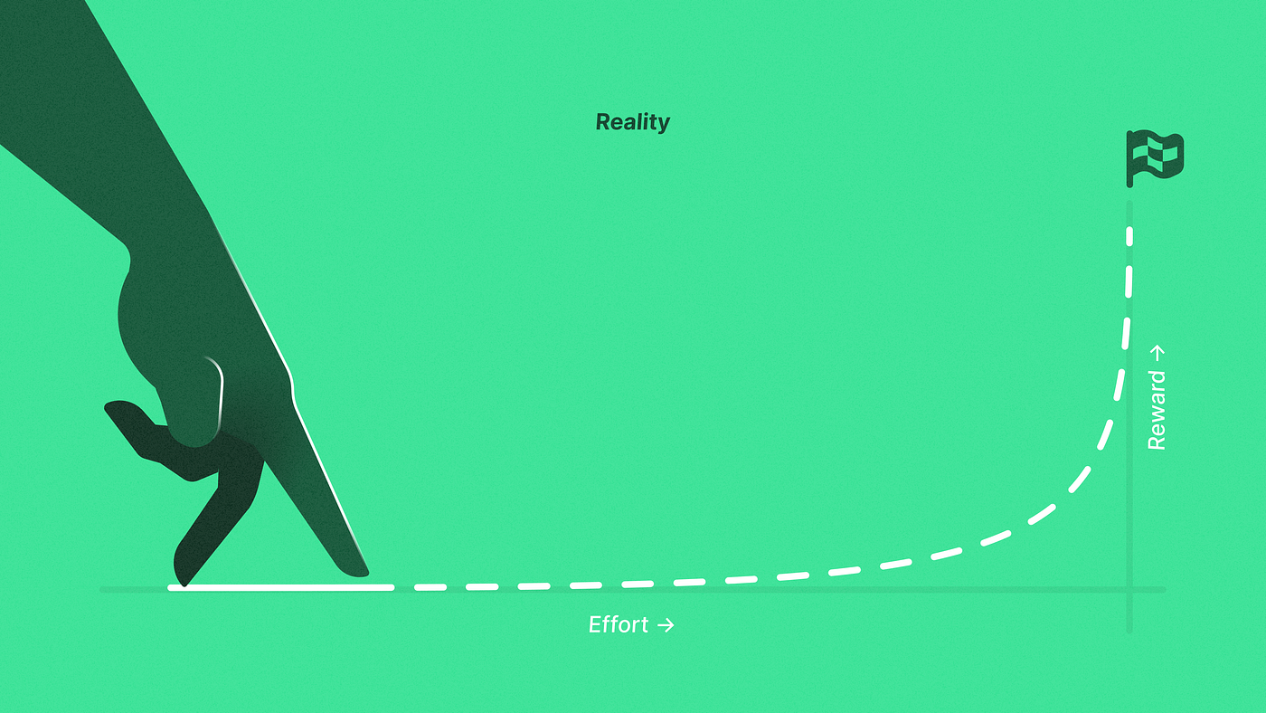
现实:复利效应
The rapid and effective execution of this transformation wouldn’t be possible without the hands-on leadership and exceptional dedication from Chloe Rice, Kyle Durand, and Sam Rose. They didn’t just direct the Polaris engineering team, but were deeply involved in the implementation details.
这种转变的快速和有效执行离不开Chloe Rice、Kyle Durand和Sam Rose的亲自领导和卓越奉献。他们不仅仅是指导Polaris工程团队,而且深入参与了实施细节。
Our team’s technical prowess and commitment to quality turned designs into a tangible, functioning reality.
我们团队的技术实力和对质量的承诺将设计转化为有形的、可运行的现实。
It took about 3 weeks to update Polaris with the uplift styles and we were happy to see that when we updated Polaris, about 86% of the admin changed automatically. The hard work was updating the remaining 14% that had gone off Polaris mainline. Anytime we made a holistic spacing change in Polaris, it would inadvertently break components that had custom spacing.
更新Polaris与提升样式大约花了3周时间,我们很高兴地看到,当我们更新Polaris时,大约86%的管理界面自动改变了。艰难的工作是更新那剩下的14%,它们已经偏离了Polaris主线。每当我们在Polaris中进行整体间距的更改时,会无意中破坏具有自定义间距的组件。
Releasing this change was also a big operational feat, we had to:
发布这个变化也是一个巨大的操作壮举,我们必须:
- Make sure the implementation of the new design language stood up to our high quality bar.
确保新设计语言的实施符合我们的高质量标准。 - Coordinate with dozens of other teams that were not only releasing new functionality, but now had to be guided through adapting those features to the new design language.
与数十个其他团队协调,这些团队不仅要发布新功能,还必须通过指导来适应新的设计语言。 - Become de-facto owners of multiple areas in the admin that had no clear owners.
成为多个在管理中没有明确所有者的区域的事实上的所有者。 - Provide support to designers and developers.
为设计师和开发人员提供支持。
This was all great on-the-ground research to show us how Polaris needs to continue to evolve to be a better system for the consumers and for the admin.
这是一项非常好的实地研究,向我们展示了Polaris需要如何不断发展,以成为更好的系统,为消费者和管理员服务。
So… what shipped? 那么... 发货了什么?
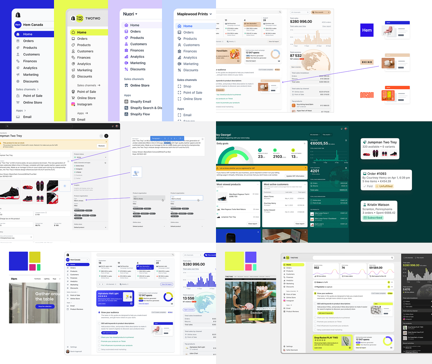
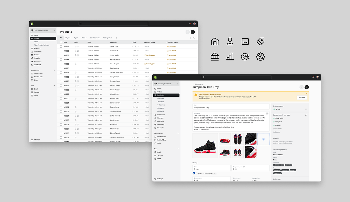
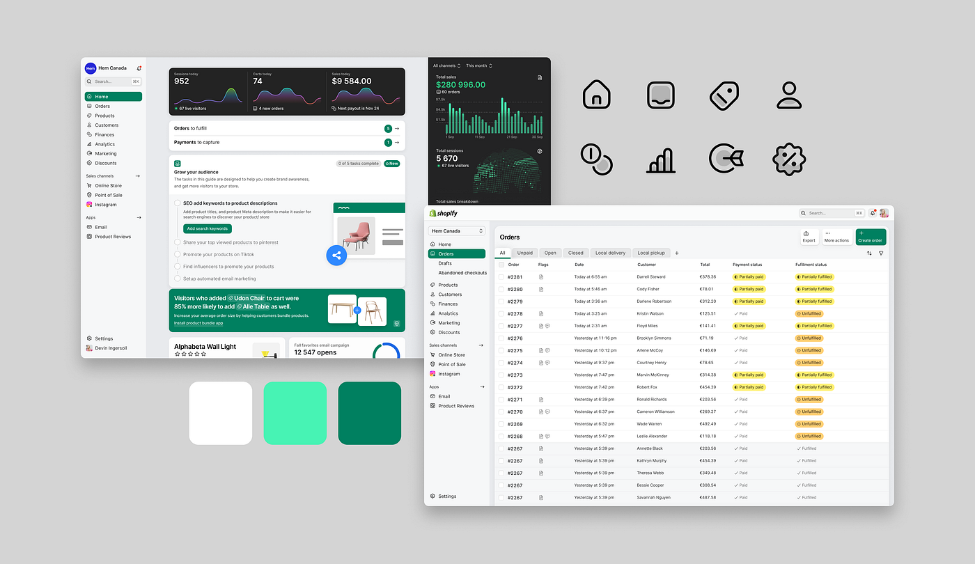
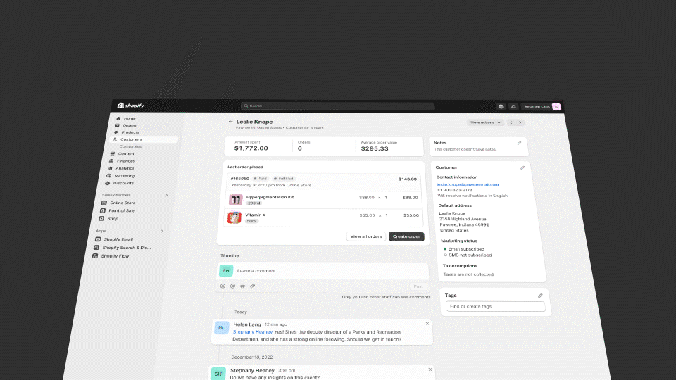
This design language is the most significant design change to Shopify’s Admin in 7 years. More than just a visual update, it elevates the admin by incorporating tactility, depth. Mirroring the tools merchants rely on in their daily operations.
这种设计语言是Shopify管理后台7年来最重要的设计变化。不仅仅是视觉上的更新,它通过融入触感和深度来提升管理后台。与商家在日常操作中依赖的工具相呼应。

The desire to bring satisfaction and joy to our merchant’s journey it’s part of Shopify’s DNA.
为了满足和带给我们的商家愉悦,这是Shopify的一部分基因。
We wanted to transpose some of that feeling to their mission control — the Shopify Admin — and make even the simplest actions, like the buttons they interact with every day, feel satisfying and fun — just like the “cha-ching” sound every time a sale is made.
我们希望将这种感觉转移到他们的任务控制中心——Shopify管理后台——使得即使是每天与之互动的最简单的操作,也能让人感到满意和有趣——就像每次完成销售时的“嘣嘣”声一样。
These are the moments when the experience feels alive and delivers small moments of joy in a merchant’s day.
这些时刻让体验变得生动,并给商家的日常带来小小的喜悦。
This is still a tool for work, so we balance these moments of joy with our increased focus on efficiency, by optimizing the UI to the type of work merchants do.
这仍然是一种工作工具,因此我们通过优化用户界面来适应商家的工作类型,以提高效率,同时平衡这些愉悦的时刻。
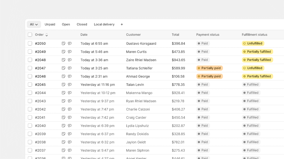
While dealing with a lot of data, merchants desire to see more of it at once, so we reduced text sizes across the board, to use space more efficiently. We’re streamlining typography and chose Inter as the Admin’s typeface. Inter was crafted specifically for computer screens, and its enhanced legibility of small text is now available to all merchants, no matter the platform or browser they use.
在处理大量数据时,商家希望一次能看到更多的数据,因此我们在整体上减小了文本大小,以更高效地利用空间。我们正在简化排版,并选择了Inter作为管理员的字体。Inter专为计算机屏幕设计,其对小字体的可读性进行了增强,现在无论商家使用哪个平台或浏览器,都可以使用这种字体。

We decided to lean more on icons as intuitive shortcuts that allow merchants to navigate and interact swiftly across the interface, while avoiding an excessive amount of text that gets in your way to get things done. Common actions like editing are replaced with space-saving icons. Icons that have been redesigned to perfectly match our typography. Lightweight and efficient, they feel approachable and have a soul that intertwines well with the new design language.
我们决定更多地依靠图标作为直观的快捷方式,使商家能够在界面上快速导航和交互,同时避免过多的文字阻碍完成任务。常见的操作,如编辑,被节省空间的图标所取代。这些图标经过重新设计,与我们的排版完美匹配。它们轻巧高效,给人一种亲近感,并与新的设计语言相得益彰。
Our new color palette is daring and vibrant. When we use color, we use full vibrancy to communicate meaning consistently. Green means go. Red means danger. Not half measures.
我们的新色彩调色板大胆而充满活力。当我们使用颜色时,我们会充分运用鲜艳的色彩来始终传达意义。绿色代表前进。红色代表危险。没有半点妥协。
Interactions are being given the attention they deserve.
交互正在得到应有的关注。
We defined a signature motion curve called Snappy. Snappy is quick, but still gives merchants a cue as to where something comes from, instead of things just appearing instantly. Snappy is progressively going to appear in many areas of the Admin over time.
我们定义了一种称为Snappy的特征运动曲线。Snappy非常迅速,但仍然能够给商家一个提示,让他们知道某物来自何处,而不是突然出现。随着时间的推移,Snappy将逐渐出现在管理界面的许多区域中。
We’re combining motion, color, and depth to make the UI feel responsive and alive, and we’re creating affordances that enable merchants to interact with the interface intuitively, without having to pause to understand if something is interactive or not.
我们将运动、色彩和深度结合起来,使用户界面具有响应和活力的感觉,并创建了能够让商家直观地与界面进行交互的便利条件,而无需停下来理解某个元素是否可交互。
Merchants’ “fresh eyes” 商家的“新鲜眼光”

Before shipping the new design language, we wanted to know what merchants thought about it. So as soon as the implementation reached a good quality level, we conducted a study, where we gave temporary access to the new experience to several merchants.
在发货之前,我们想知道商家对新的设计语言有何看法。因此,一旦实施达到了良好的质量水平,我们进行了一项研究,给予了几个商家临时访问新体验的权限。
We weren’t looking for validation. We wanted to get an understanding whether merchants’ perceptions were lining up with the intentions behind the new design language. We were also getting ready for a preview of the kind of feedback merchants would have in regards to such a dramatic change in visual design versus the level of disruption this would have on their habits in the Admin, which is to be expected.
我们并不是在寻求认可。我们想要了解商家对新设计语言背后意图的看法是否一致。我们还准备预览商家对视觉设计如此巨大变化与其在管理界面习惯上可能产生的影响程度的反馈,这是可以预料的。
Good news, the new design language was well received. “Familiar”, “refined”, “denser”, “useful” were terms that were used to describe the impact of the new design language. Merchants who also noticed the change called out the value in the “cleaner” design, and appreciated a higher density of information. Button styling and tactility was also called out as easier to see, and fun to interact with.
好消息,新的设计语言受到了良好的反响。“熟悉”,“精致”,“更紧凑”,“实用”是用来描述新设计语言影响的词语。商家们也注意到了这种变化,并称赞了“更清洁”的设计,以及更高密度的信息。按钮的样式和触感也被称为更容易看到,并且与之互动更有趣。
Even for merchants that thought such an update “doesn’t really matter”, we heard some acknowledgement of the UI feeling “fresher” and making their job “a little less boring”. Every small adjustment and improvement stacks up to exactly this. Although undisruptive, making menial tasks more enjoyable was exactly what we were aiming for.
即使对于认为这样的更新“并不重要”的商家来说,我们听到了一些对用户界面感觉“更清新”、使工作“稍微不那么无聊”的认可。每一个小的调整和改进都正是这样。虽然不会造成干扰,但让琐碎的任务更加愉快正是我们的目标。
Sweating the details down to the pixel, discussing the tiniest things you can imagine… details aren’t just details. They make the product. And that product gives entrepreneurs the superpowers to achieve their goals.
汗水滴滴,细致到像素级别,讨论你能想象到的最微小的事情...细节不仅仅是细节。它们构成了产品。而这个产品赋予创业者实现目标的超能力。
More to come 更多即将到来
Like a curtain drawing back on a performance, what goes on behind the scenes can be chaotic and messy until the moment of the reveal. We hope that this peek at the process of building this new design language shows how the many actors, set designers and directors involved can come together when putting together such a substantial production. And I want to take a moment to acknowledge everyone from the Polaris team who contributed to this effort: Aaron Casanova, Alex Page, Aveline Thelen, Bernardo Garcia, Charles Lee, Chloe Rice, Dominik Wilkowski, Guilherme Santos, Jared Fanning, Jess Telford, JJ Galipeau, Joe Thomas, Johan Stromqvist, Kyle Durand, Laura Griffen, Lo Kim, Marten Bjork, Mateus Ferreira, Melanie Tayler, Natasha Lloyd, Nayeob Kim, Raquel Breternitz, Sam Rose, Sara Hill, Selene Hinkley, Sophie Schneider, Susie Simon, Thomas Jonkajtys, Yesenia Perez-Cruz, Yuraima Estevez.
就像幕布拉开一样,幕后的事情可能会混乱而凌乱,直到揭示的那一刻。我们希望这次对构建这种新设计语言的过程的一瞥能够展示出参与其中的众多演员、布景设计师和导演们在组织如此重大的制作时是如何协同合作的。我想花一点时间向为这项工作做出贡献的Polaris团队的每个人致以敬意:Aaron Casanova、Alex Page、Aveline Thelen、Bernardo Garcia、Charles Lee、Chloe Rice、Dominik Wilkowski、Guilherme Santos、Jared Fanning、Jess Telford、JJ Galipeau、Joe Thomas、Johan Stromqvist、Kyle Durand、Laura Griffen、Lo Kim、Marten Bjork、Mateus Ferreira、Melanie Tayler、Natasha Lloyd、Nayeob Kim、Raquel Breternitz、Sam Rose、Sara Hill、Selene Hinkley、Sophie Schneider、Susie Simon、Thomas Jonkajtys、Yesenia Perez-Cruz、Yuraima Estevez。
We’re far from finished. 我们还远未完成。
Our goal is to make Shopify’s admin the best place for our merchants to run their businesses, and we’ll keep evolving our design language to be the best, most professional tool they can rely on. That means always looking to the future and never letting ourselves grow stale.
我们的目标是使Shopify的管理后台成为商家经营业务的最佳场所,我们将不断发展我们的设计语言,使其成为商家可以依赖的最好、最专业的工具。这意味着始终展望未来,永远不让自己变得陈旧。
When you open Shopify’s admin today, some areas might still feel untouched — new illustrations, for example, are still being evolved and will roll out alongside ambitious updates and evolutions of our design patterns. But before we do that, we want to lean in and listen to what our merchants think about this powerful tool that we have the privilege to design. So stay tuned for more.
当您打开Shopify的管理界面时,某些区域可能仍然保持原样 - 例如,新的插图仍在不断发展,并将与我们设计模式的雄心勃勃的更新和演变一起推出。但在此之前,我们希望倾听我们的商家对这个强大工具的看法,因为我们有幸能够设计它。所以请继续关注。


